Navigation
My roles
Visual Design Lead
UI Designer
Graphic Designer
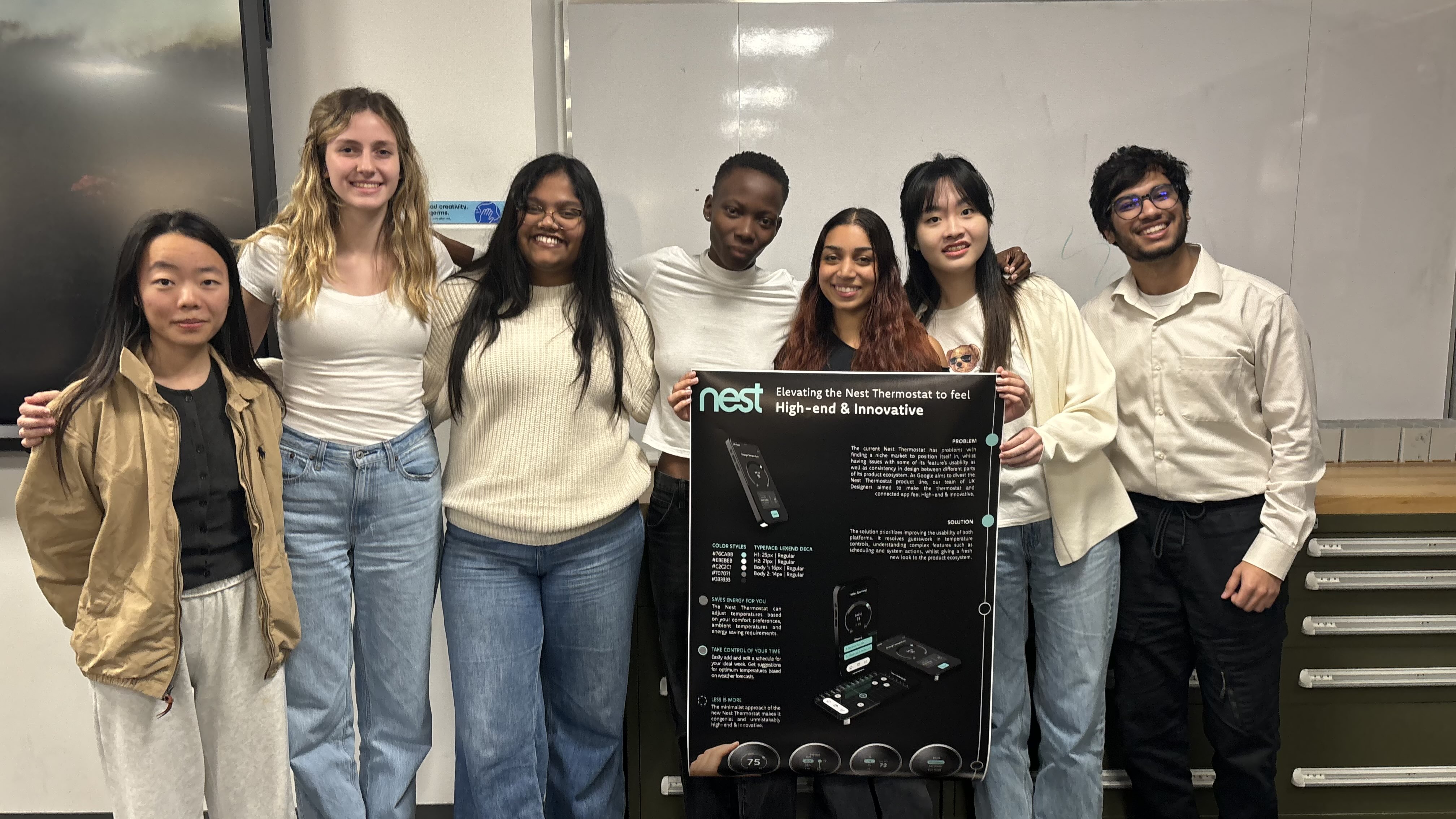
Team
6 Team members across 3 Disciplines
Tools
Figma
Adobe Illustrator
Adobe Photoshop
Duration
10 weeks
रूपरेषा
Overview
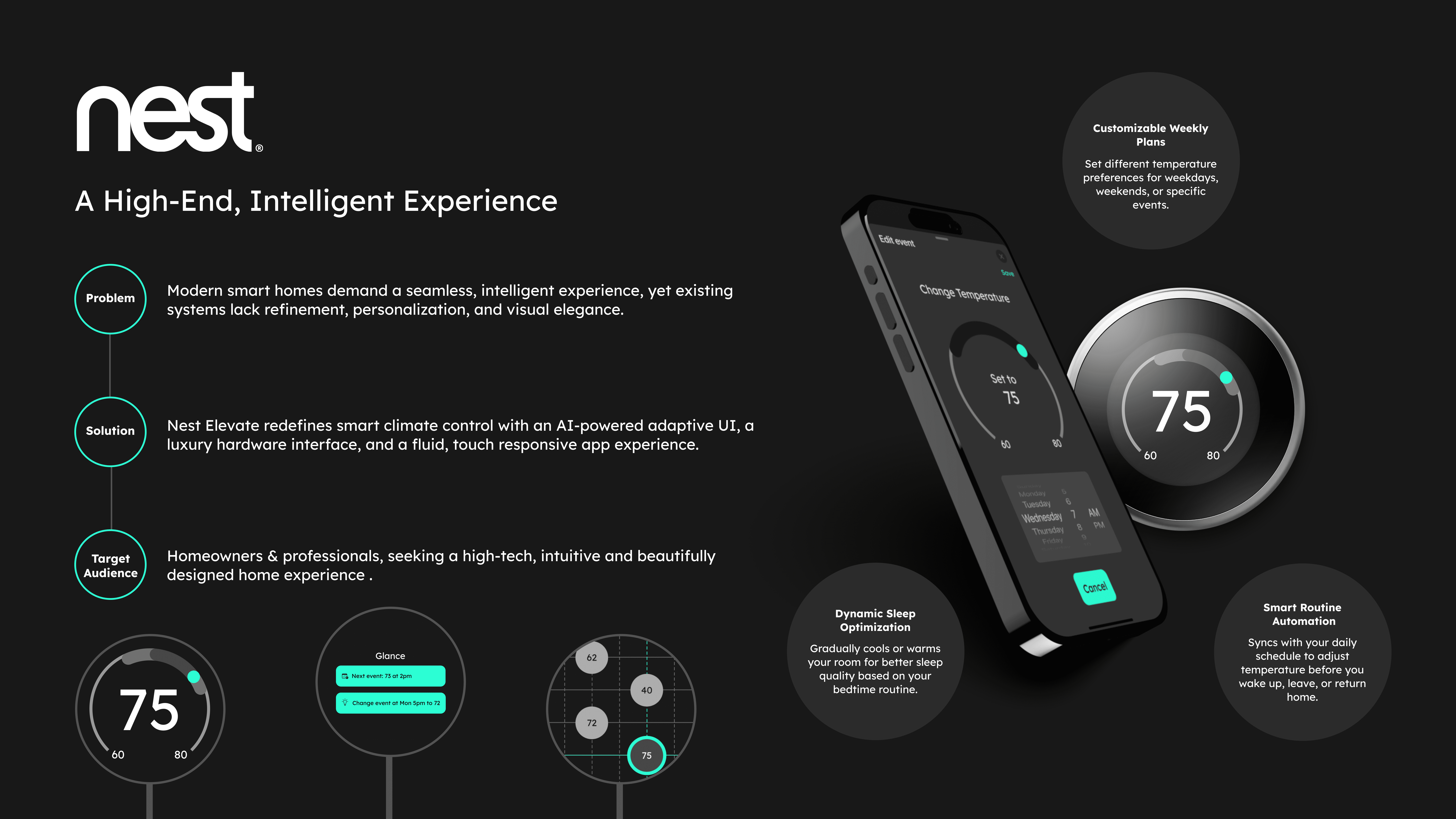
The project was based on a hypothetical scenario wherein Google is planning on divesting the Nest Thermostat lineup for new markets. As Designers, we explored visual branding, re-evaluated existing user flows and created new features and experiences for the new market.
My role
Visual Design Lead: Developing and integrating design directives into deliverables, Integrating the 'High-end & Innovative' theme in all materials.
UI Designer: Developing UI concepts, facilitating design iteration cycles.
Graphic Designer: Creating promotional material to market the new Nest Thermostat
ओझरतं
Sneak Peak
Slide to see the difference!
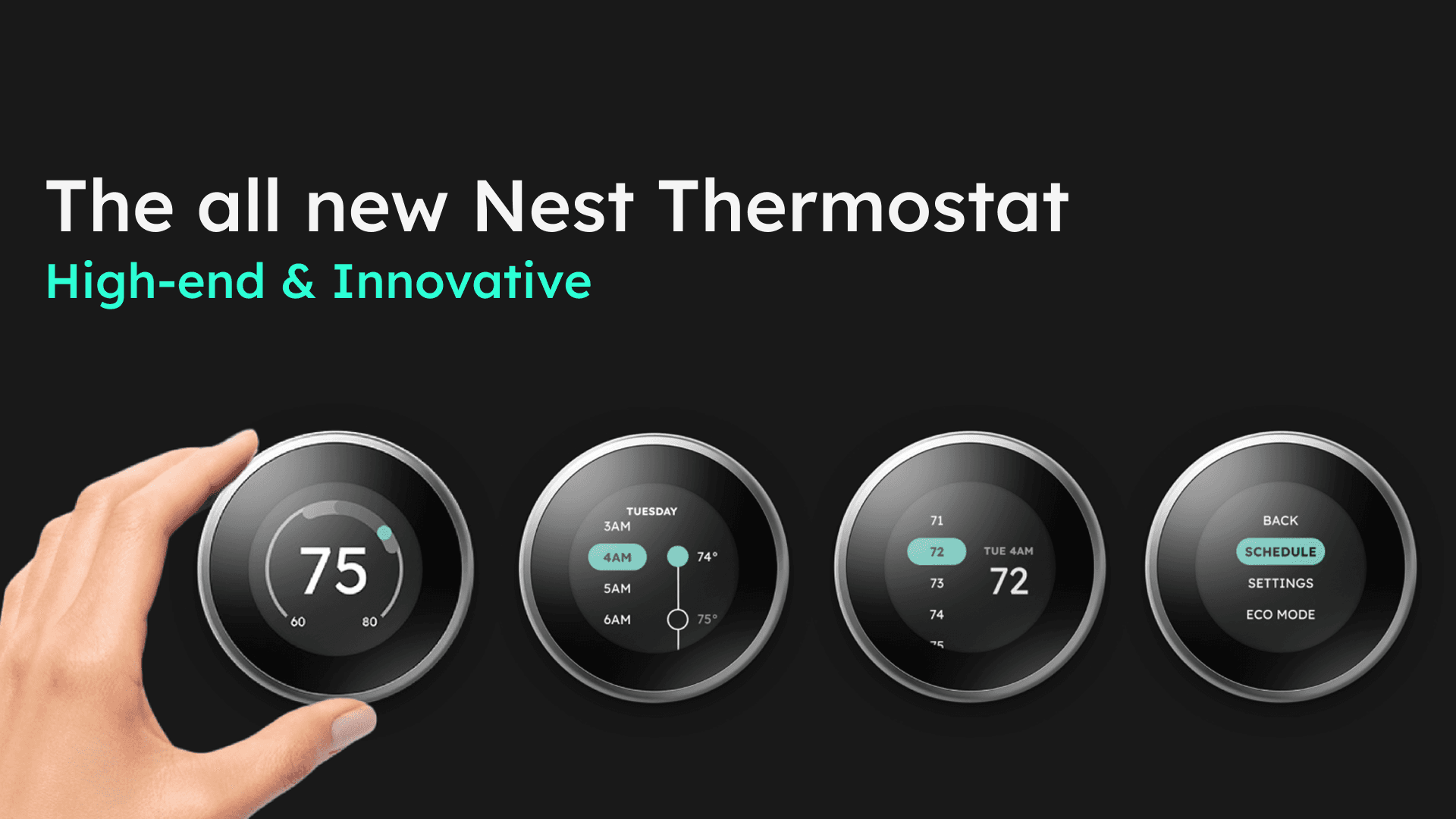
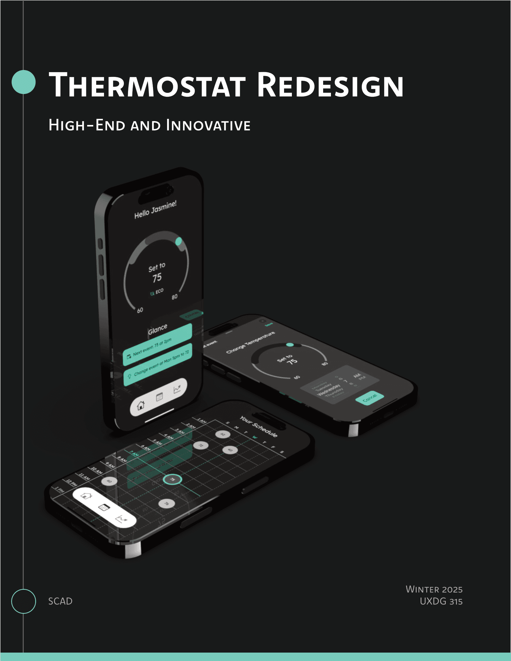
A visual overhaul to the Nest Thermostat lineup
सद्यस्थितीत
The Scenario
Google plans to divest their Nest Thermostat ecosystem and wants to exude the following themes:
Experience that feels welcoming in an office environment
Designed for tech-savvy individuals desiring a premium experience

For eco-concious individuals wanting minimal environmental impact
Devices
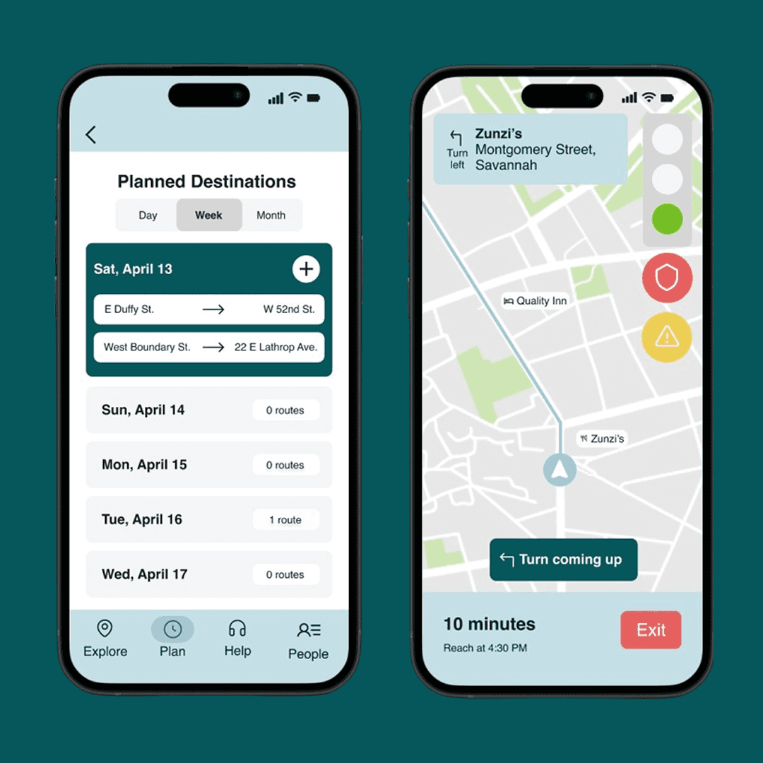
The goal was to improve navigation and feel of these devices, alongside the mobile app.
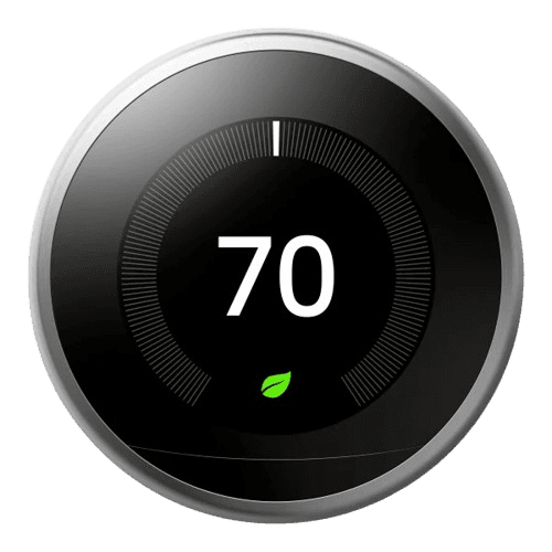
Nest Thermostat 3rd Gen
For High-end & Innovative
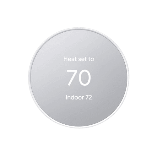
Nest Thermostat
For Green & Affordable
Timeline
This 10 week project was divided into 4 phases:
Creating Design Directives
Phase 1
Developing UI concepts
Phase 2
Concept Execution
Phase 3
Creating Deliverables
Phase 4
Challenges
These were the challenges put forth for this project:
Random Teammates
Teammates were assigned, and couldn't be chosen
Theme & Team switching
Switching themes & teams for each phase
True to design
Thermostat prototypes needed to mimick the real life conditions
पहिला टप्पा - डिझाइनचे नियम बनवणे
Phase 1 - Creating Design Directives
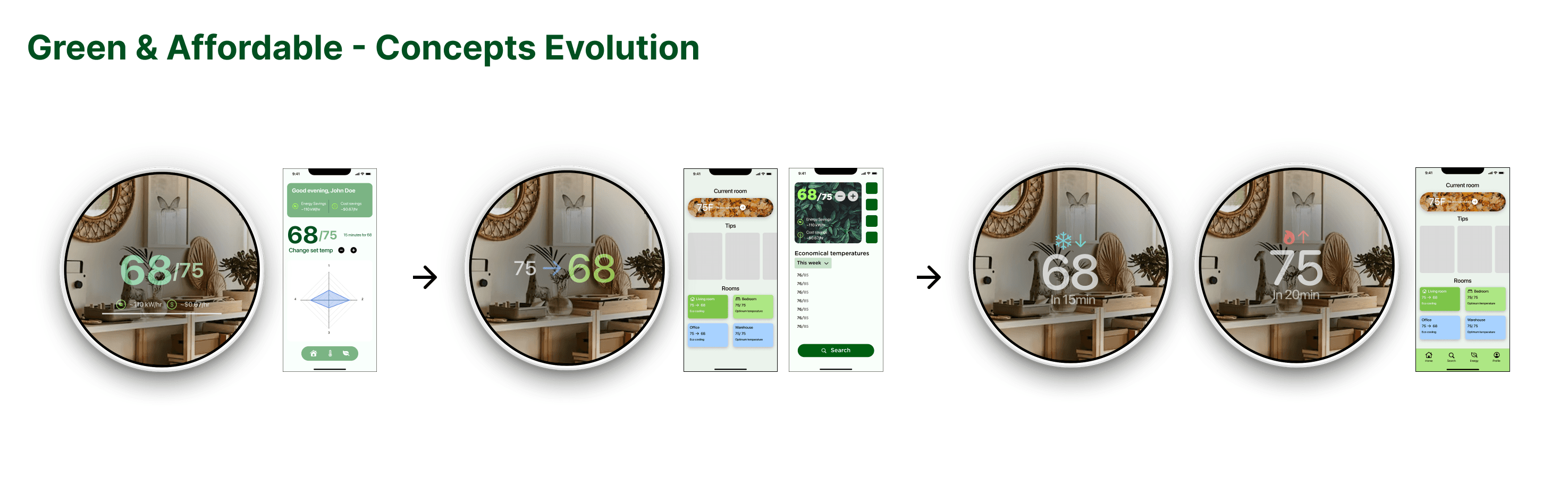
I was on the 'Green & Affordable' team for Phase 1 - different from my next phase teams.
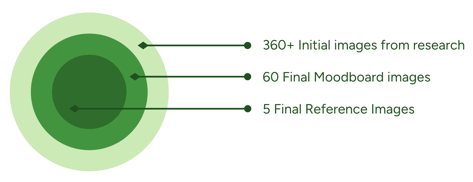
Moodboard
After shortlisting and combining our moodboards, we started keying each image based on its characteristics.
दुसरा टप्पा - कच्चं यु आय बनवणे
Phase 2 - Developing UI concepts
In this individual exercise, everyone had to develop thermostat and phone concepts based on the design directives.
My Design Process
I created multiple iterations for all concepts before landing on 3 for submission. I started off with rough sketches.
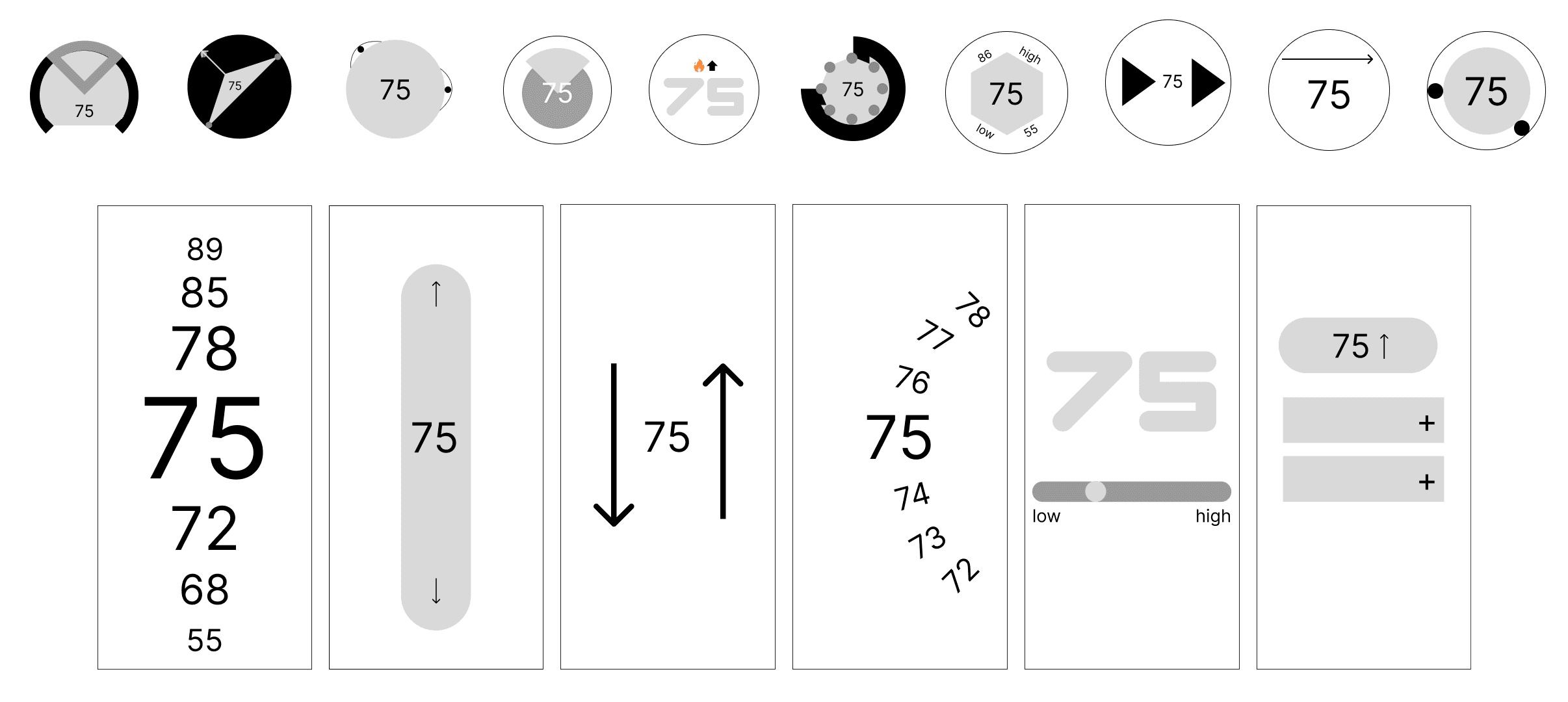
10 thermostat sketches and 6 phone screen sketches (total 16)
Next, I used an overlay for the two thermostats that mimicked real life lighting situations and material interaction.
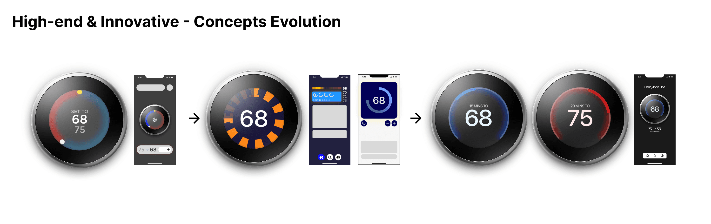
My concept for 'High-end & Innovative' was selected by voting as the most appropriate one and I was selected to be the Visual Design Lead for the next phase.
तिसरा टप्पा - प्रोटोटाईप बनवणे
Phase 3 - Concept Execution
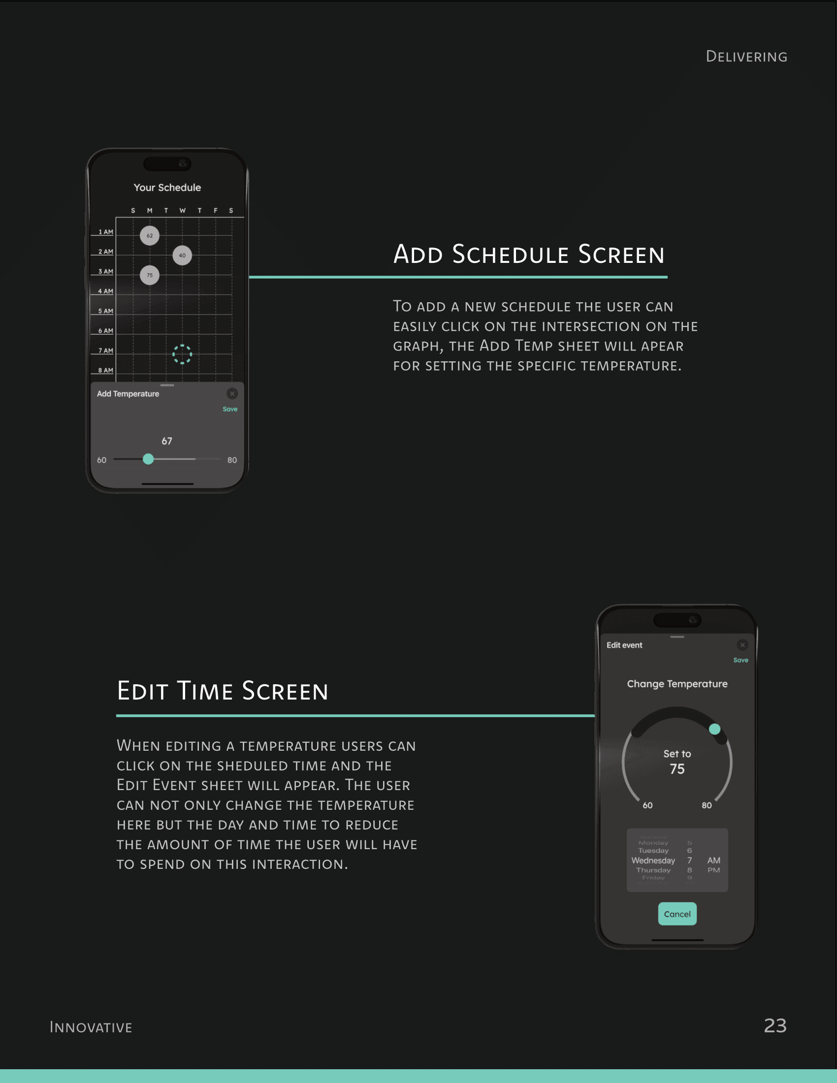
In phase 3 we had to redesign existing features and user flows to fit our theme of 'High-end & Innovative'.
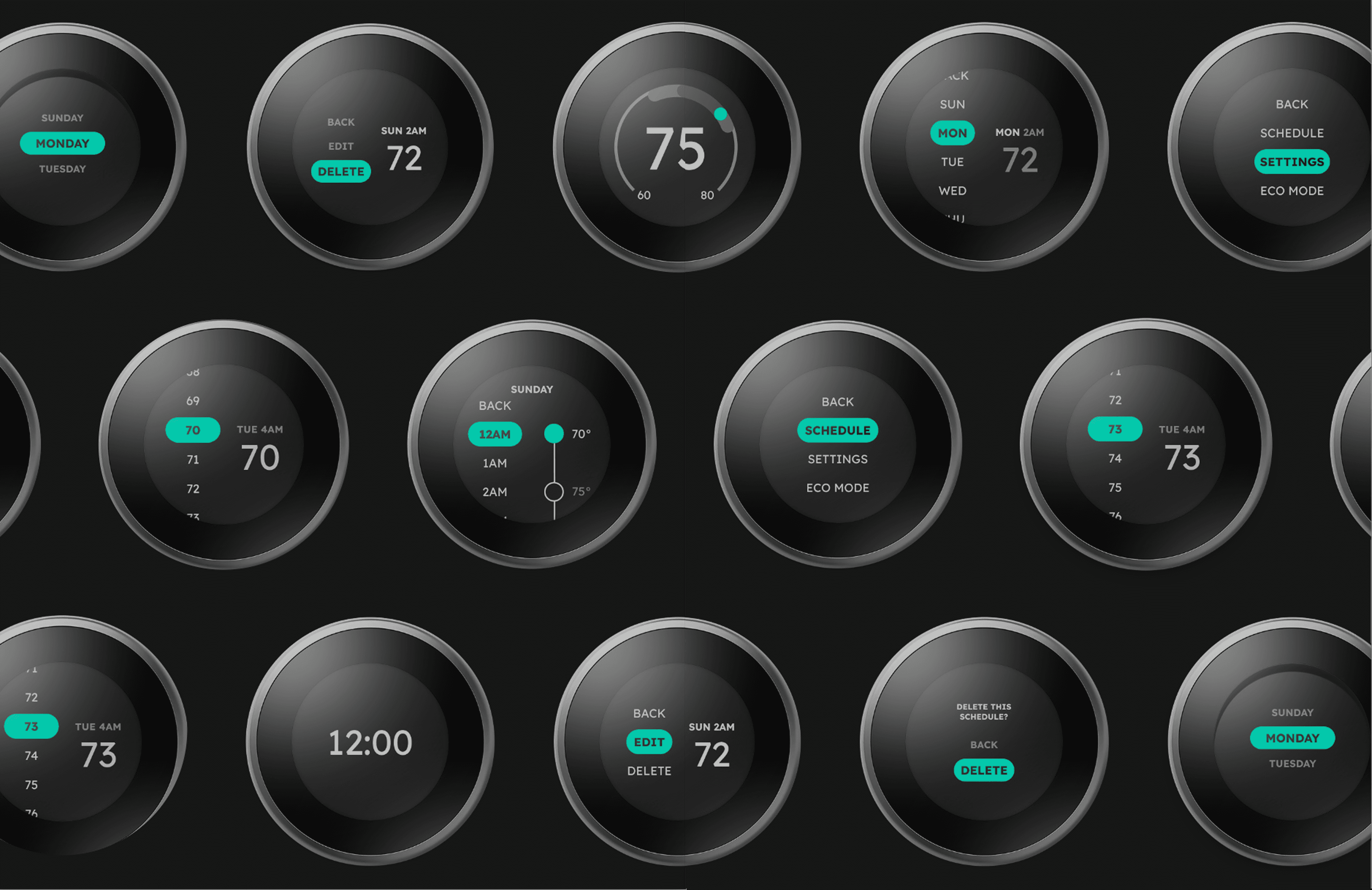
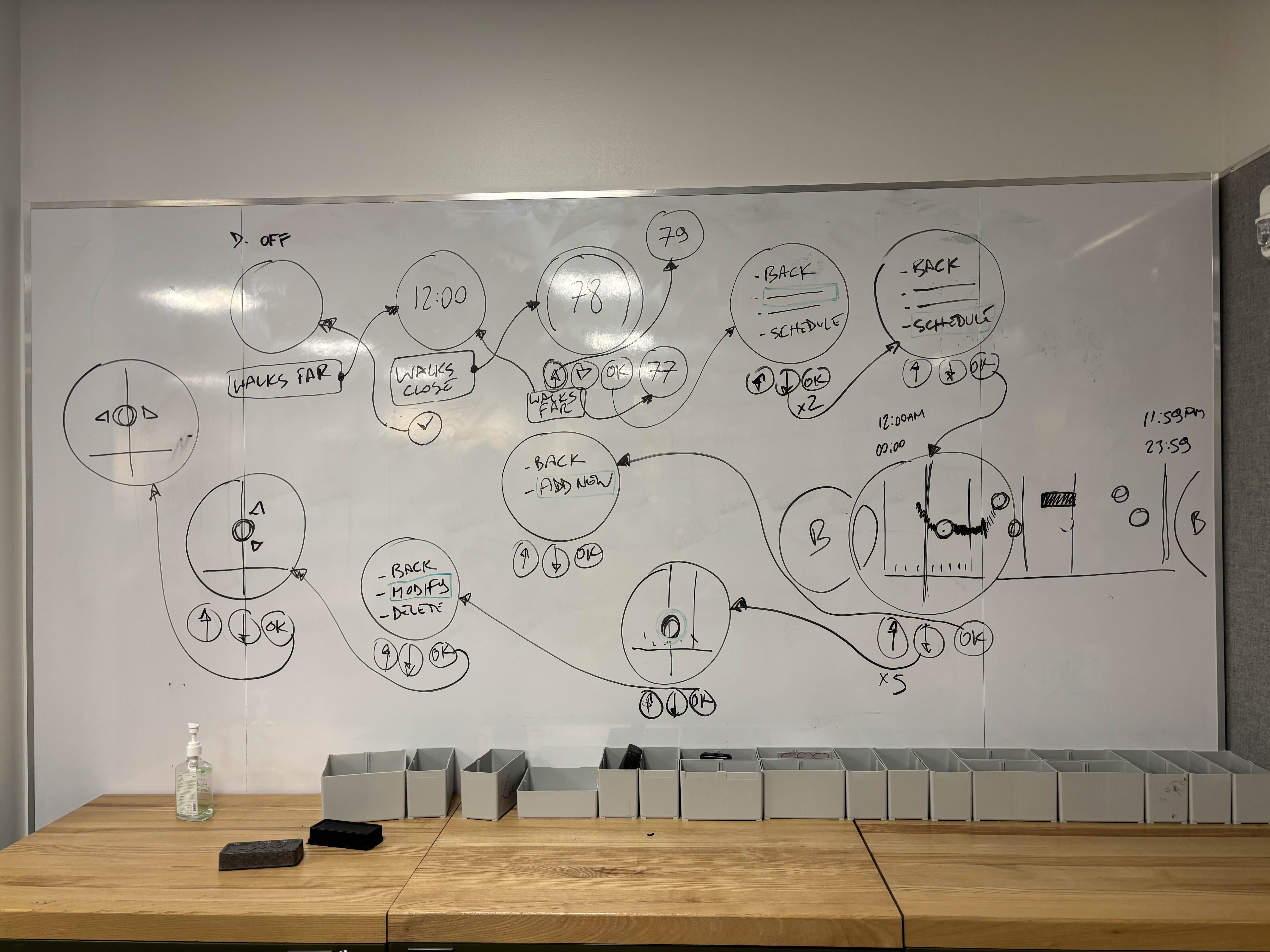
Iterative Process
Figma pages on my team's design file
We used the iterative approach for our designs for quicker workflows and research-backed decisions.
Doesn't matter if it looked pretty - if it didn't work, it gets scraped.
This let us focus on the functionality of the device instead of the form. This resulted in vast improvements in usability and quality.
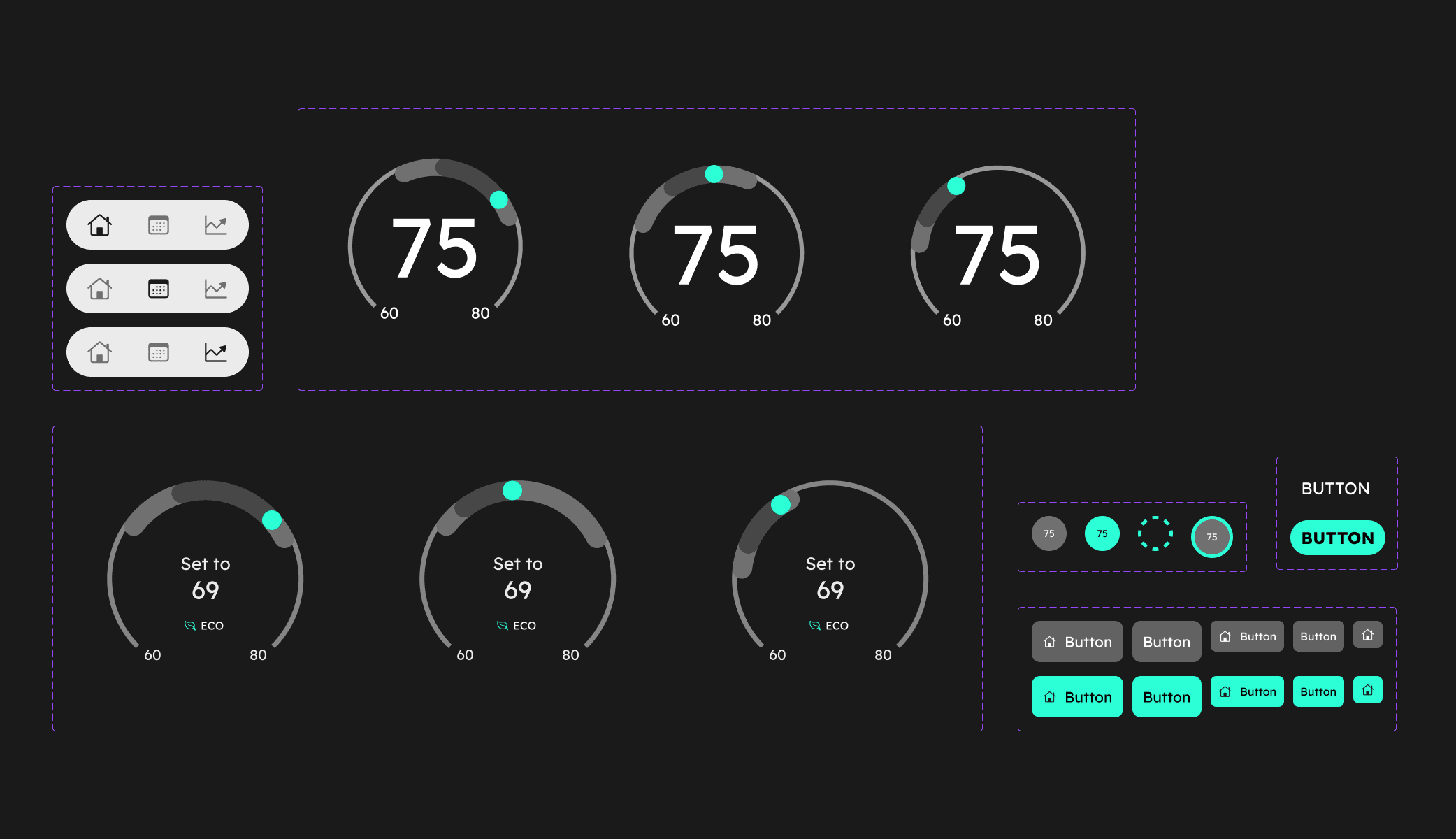
Low to Mid Fidelity
For this stage, we experimented with different layouts to test different wireflows for the two platforms.
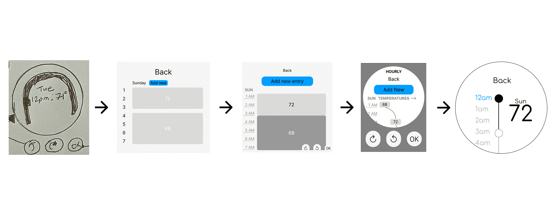
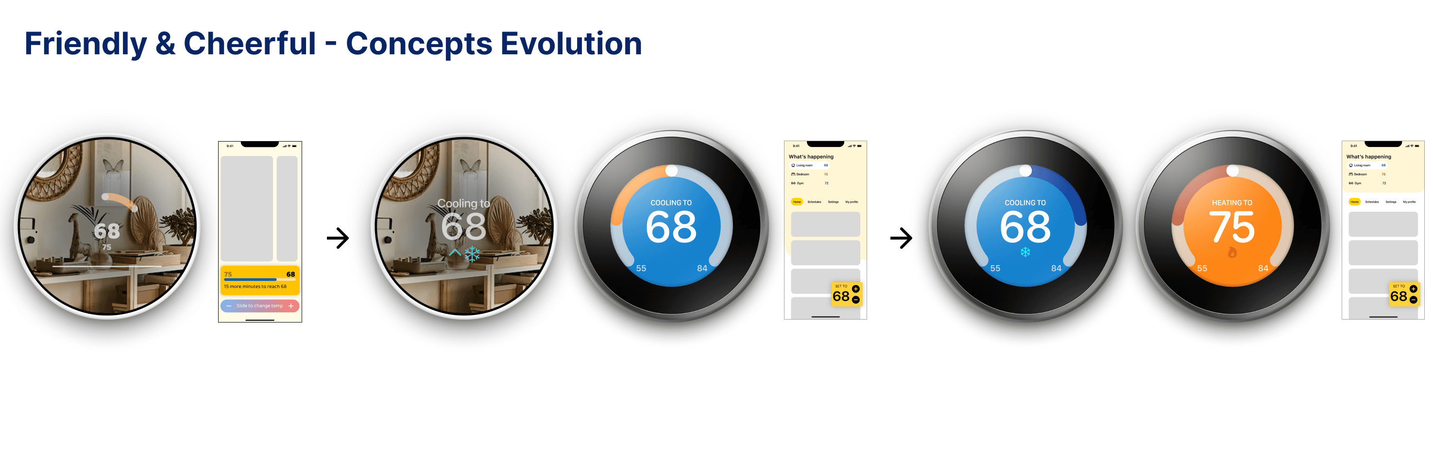
Thermostat Evolution - Schedule page
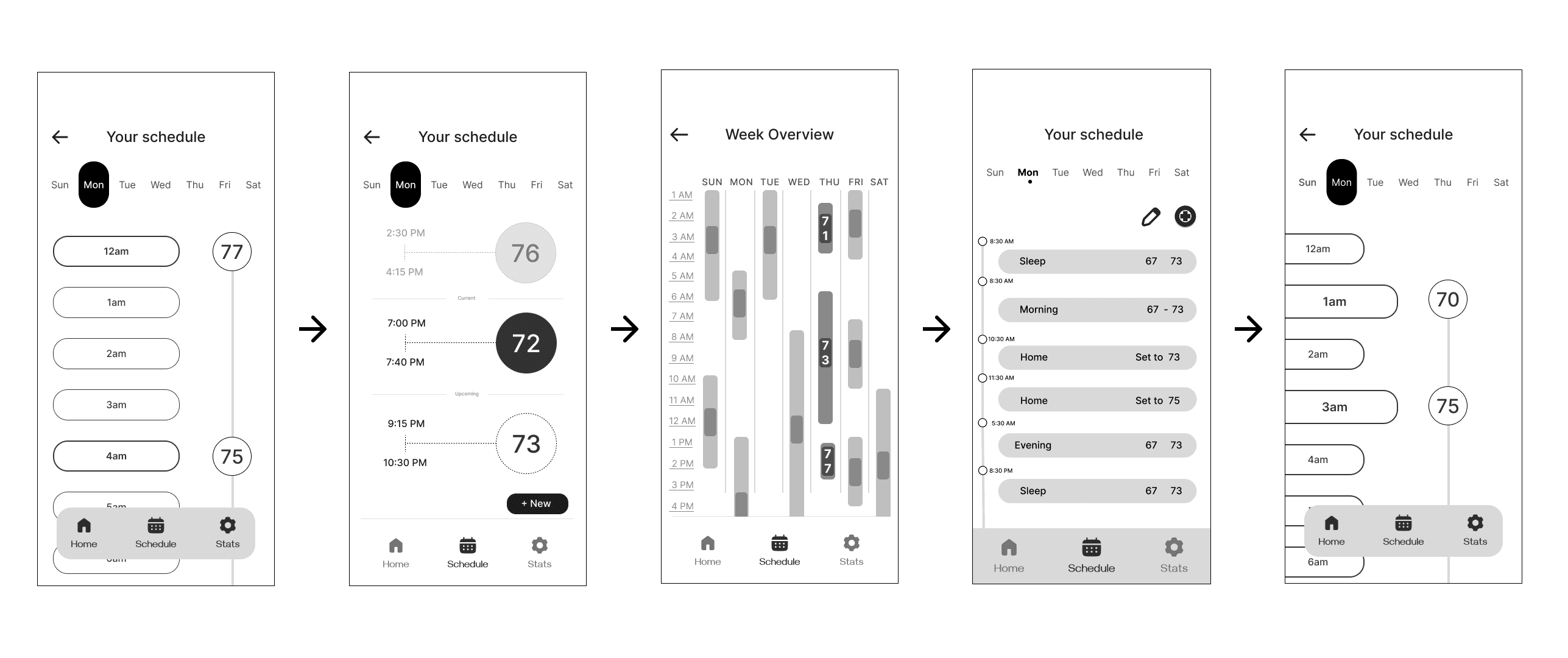
Phone Evolution - Schedule page
Mid Fidelity prototype testing
After 6 iterations of the entire user flow for both devices, we user tested our prototypes:
SUS Overall: 68.75%
Just above threshold
SUS Overall: 65.83%
Below threshold
Insights
Due to low SUS scores, we ideated the next actionable steps:
Cutting unnecessary steps
Some tasks required more steps than required, confusing the users with input
Expanding possible actions
Exploring additional input methods using gestures
Designing with restrictions
Creating artificial restrictions/design requirements to ensure consistency
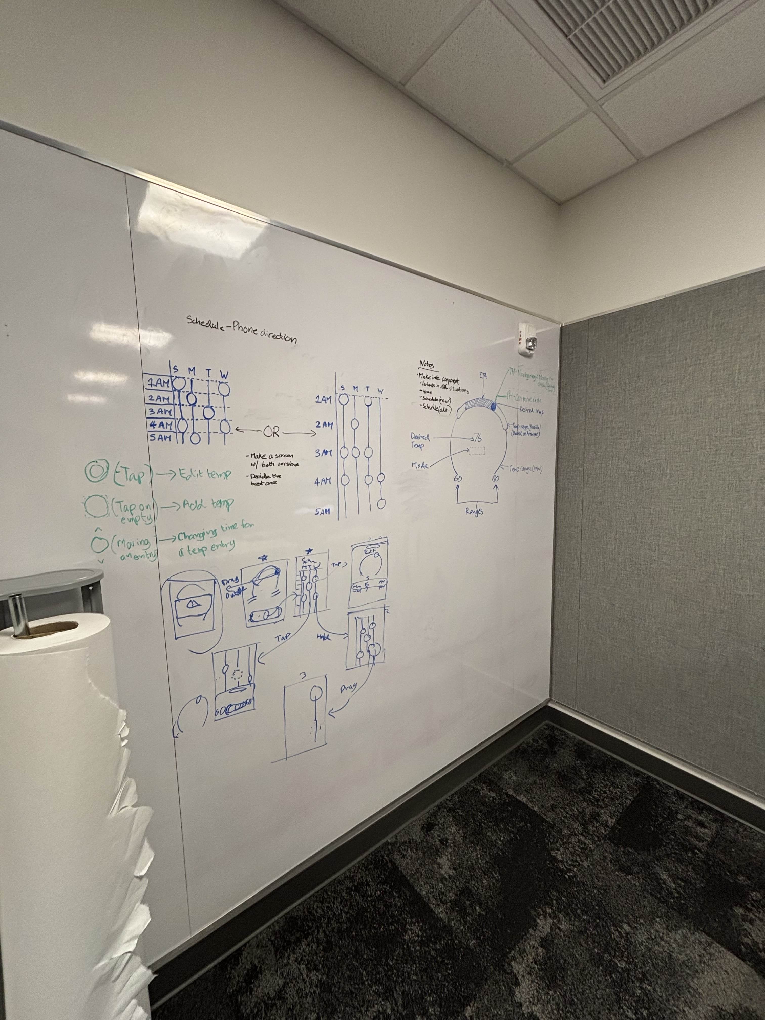
Back to drawing board
We went back to sketching and ideating concepts based on user feedback to improve information architecture and user flow
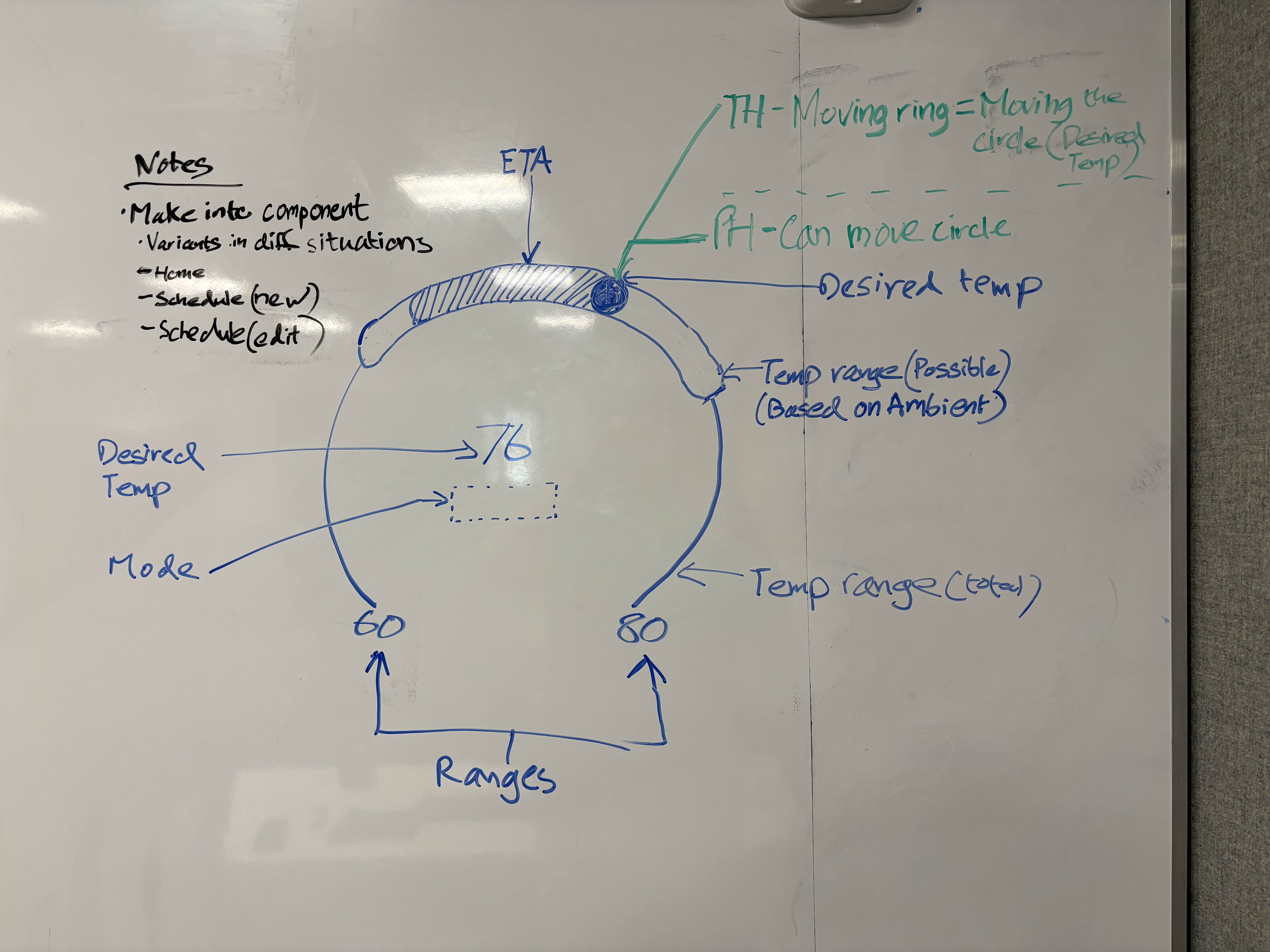
Temperature Gauge interaction ideation (Thermostat)
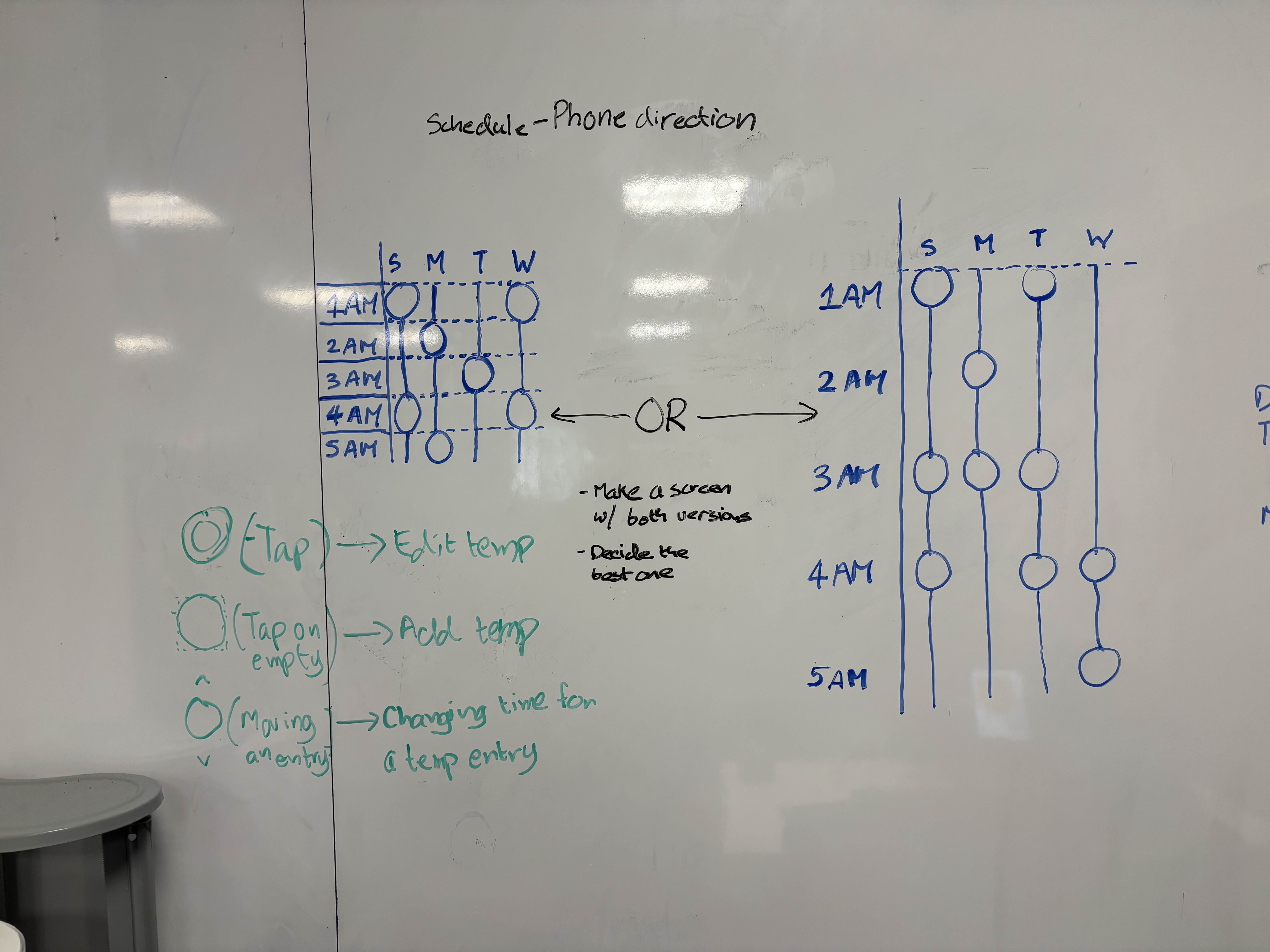
Temperature entries layout options in the schedule page (Phone)
These were the final sketches for the high fidelity transition, developed by me.
Mid to High Fidelity
We focused on research-backed improvements and visual refinement on both platforms.
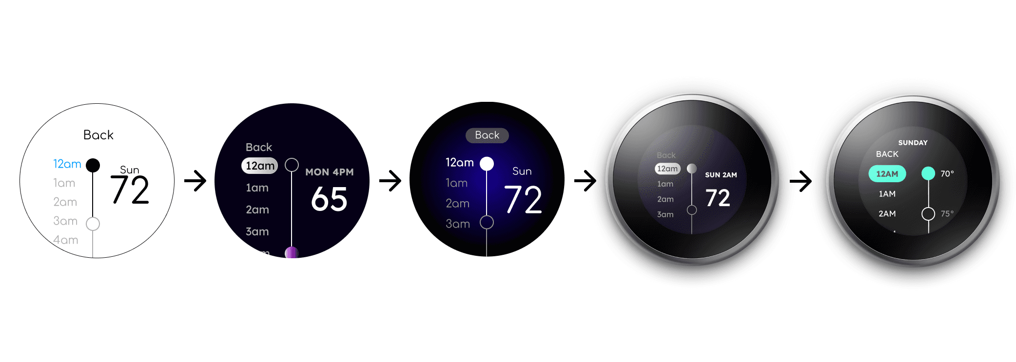
Thermostat Evolution - Schedule page
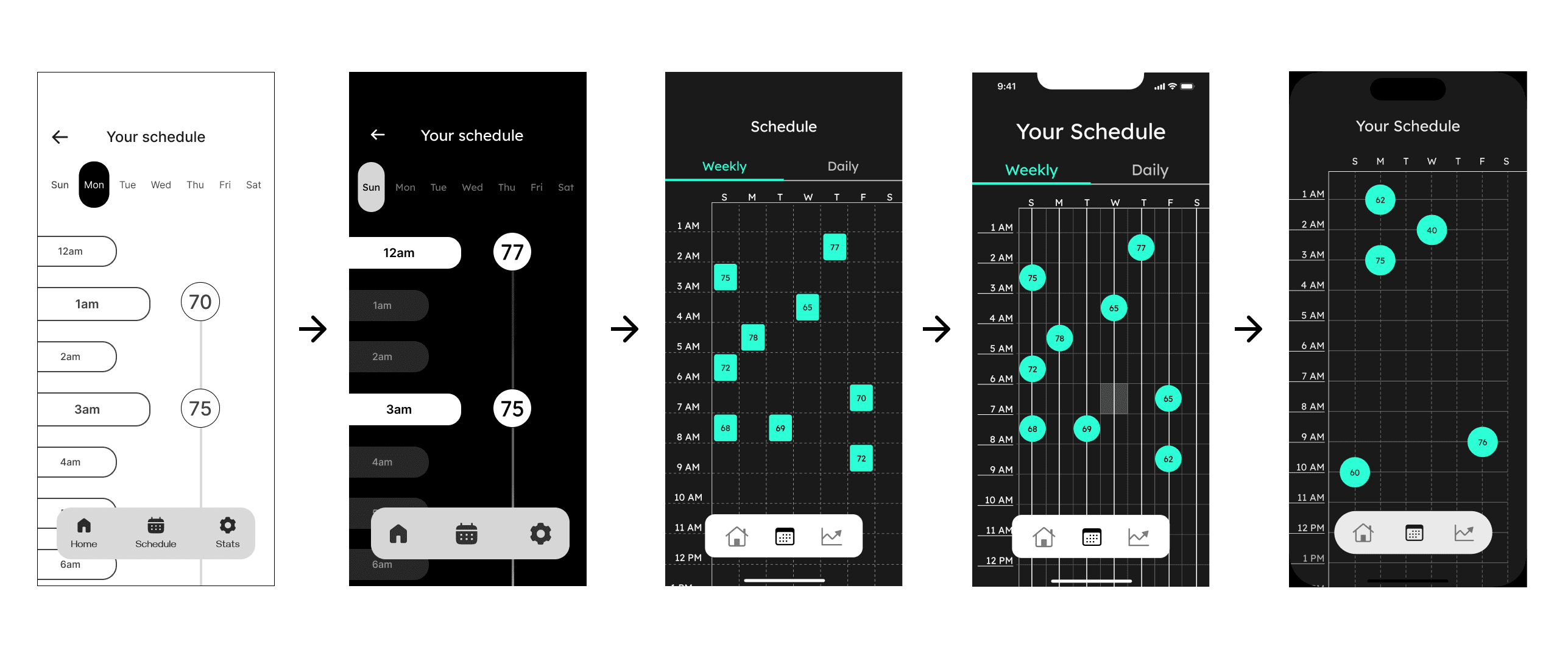
Phone Evolution - Schedule page
High Fidelity Prototype Testing
We conducted a second round of user testing with the following results:
SUS Overall: 72.35%
Within Threshold
SUS Overall: 69.87%
Just above threshold
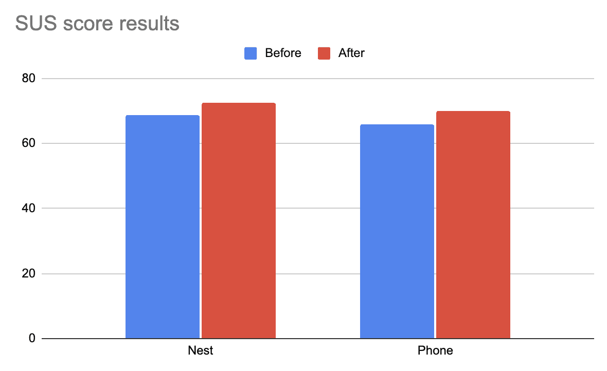
There was a noticeable improvement for both platforms, pushing both in the usability threshold.
चौथा टप्पा - प्रोटोटाईप बनवणे
Phase 4 - Creating Deliverables
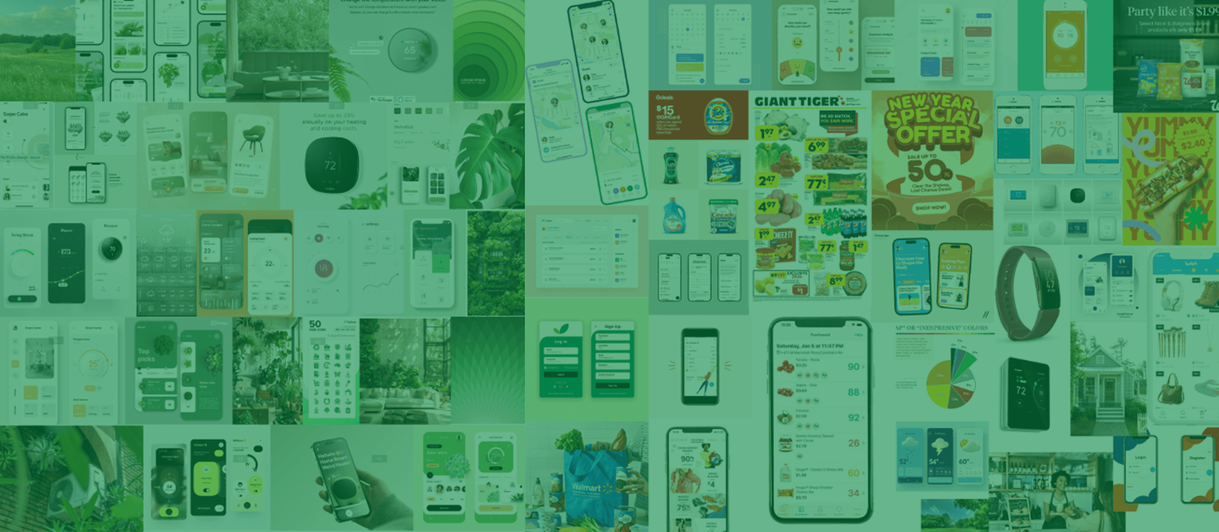
We had a total of 7 deliverables, from a Look Book to a Magazine.
मी काय शिकलो
What I learned
Separating the design from the designer
Earlier in the process, I used to feel attached to UI designs that were objectively worse than other versions. I felt dejected during this time, and I had to constantly remind myself to look at the process more objectively. Separating myself from the designs helped me make more rational decisions.
Failing early >> Failing later
Having remembered other design projects that had to be done in crunch, I wanted to make sure that the later half of the project went as smoothly as possible. As the Visual Design lead, I proposed to my team to constantly experiement with new layouts and designs near the start of phase 3. Doing so not only increased our speed as designers, but also gave us a chance to conduct user tests twice - something which no other team could do.
Thank you for reading!
तुम्हाला कदाचित हे आवडेल