Nest
Project
2025
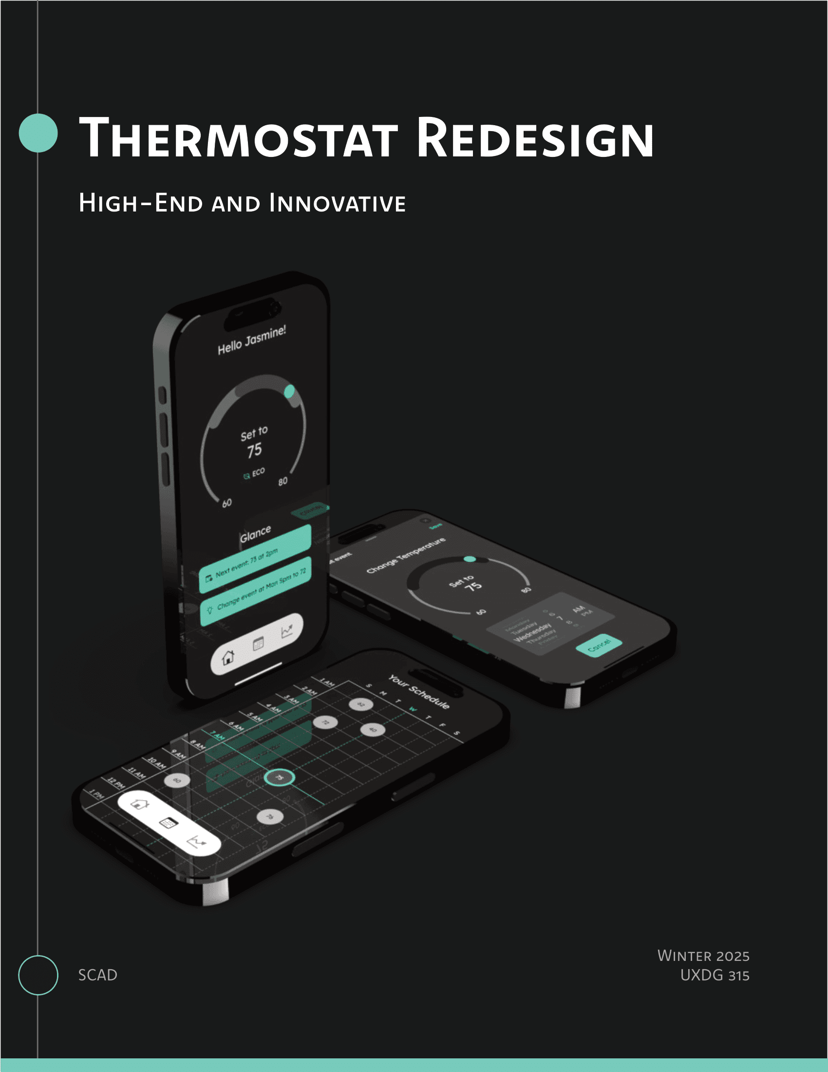
Redesigning the Nest ecosystem
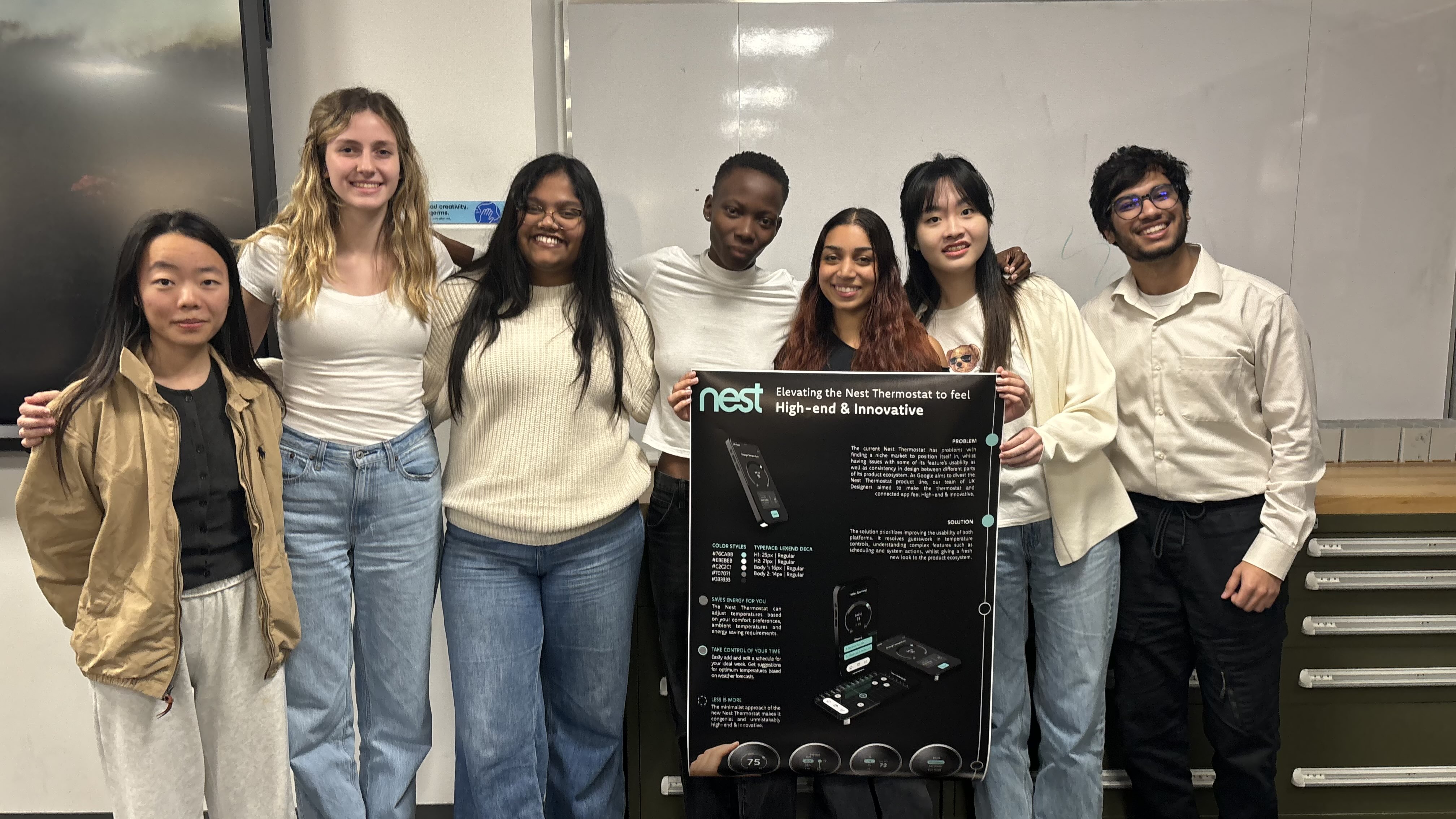
In this speculative project, My team and I designed a strategic divestiture of the Google Nest lineup for a new market. I led the visual rebranding, re-engineered core user flows, and architected new features tailored to meet the specific needs of a diverse user base
My role
Visual Design Lead: Developing and integrating design directives into deliverables
UI Designer: Developing UI concepts, facilitating design iteration cycles.
Graphic Designer: Creating promotional material to market the new Nest Thermostat
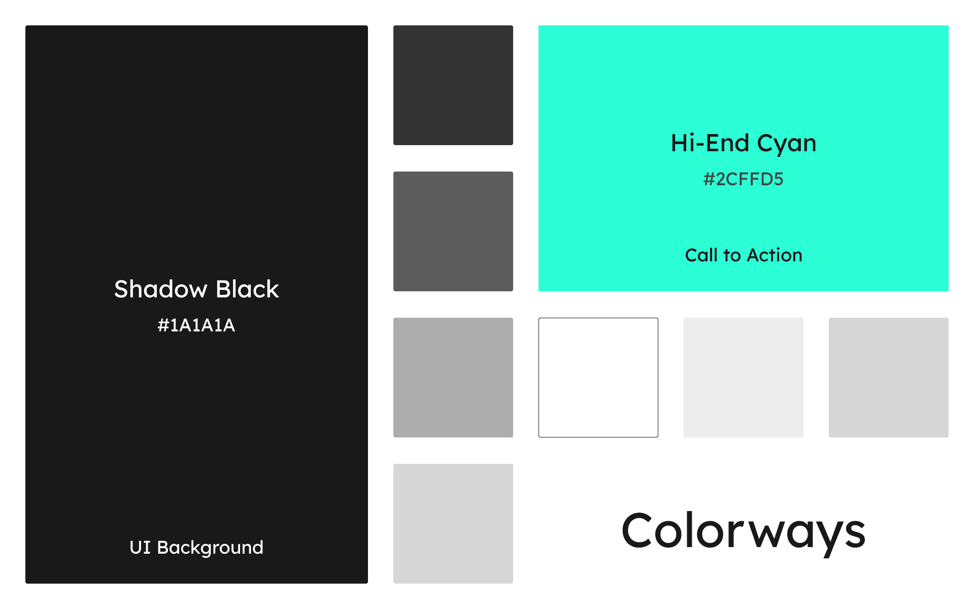
6
Wireflow iteration cycles
+2.7%
Average improvement in System Usability Score
3
New user flows added
7
Deliverables
My roles
Visual Design Lead, UI Designer, Graphic Designer
Tools
Figma, Adobe Illustrator, Adobe Photoshop
Team
6 Team members across 3 Disciplines
Duration
10 weeks
Gallery
गॅलेरी
Slide to see the difference!
Context
सद्यस्थिती
This project involved revamping two products in the Nest ecosystem:
Nest Thermostat 3rd Gen
Mobile App
We first identified the constraints of using an integrated display, learning more about the thermostat specifications:

Nest Thermostat Specifications
Problem Space
Our team set out to fix the following issues between the two systems:
Inconsistency
Feature Disparity
Outdated Visuals
Methods
पद्धती
To create the design directives for the new visual direction, each designer had to come up with their own design sketches.
10 thermostat sketches and 6 phone screen sketches (total 16)
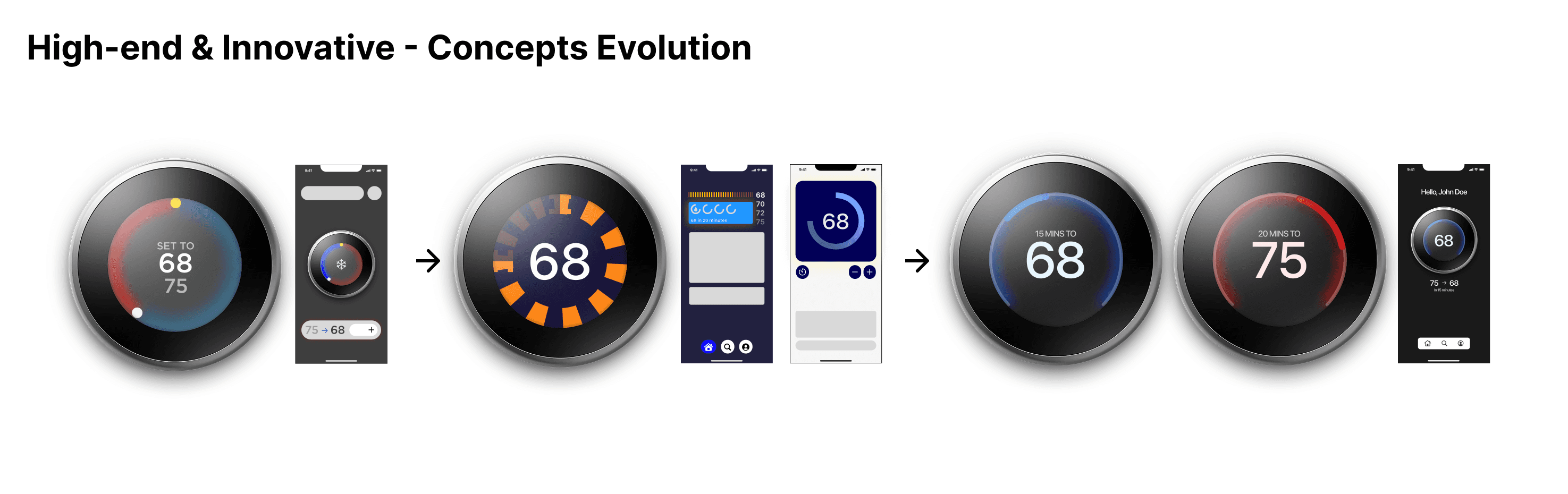
My concept for 'High-end & Innovative' was selected by voting as the most appropriate one and I was selected to be the Visual Design Lead for the next phase.
Team Process
Figma pages on my team's design file
Starting off, my team and I adopted the iterative process, which allowed us to be fast and take data-driven decisions quickly.
Doesn't matter if it looked pretty - if it didn't work, it gets scraped.
Testing
टेस्टिंग
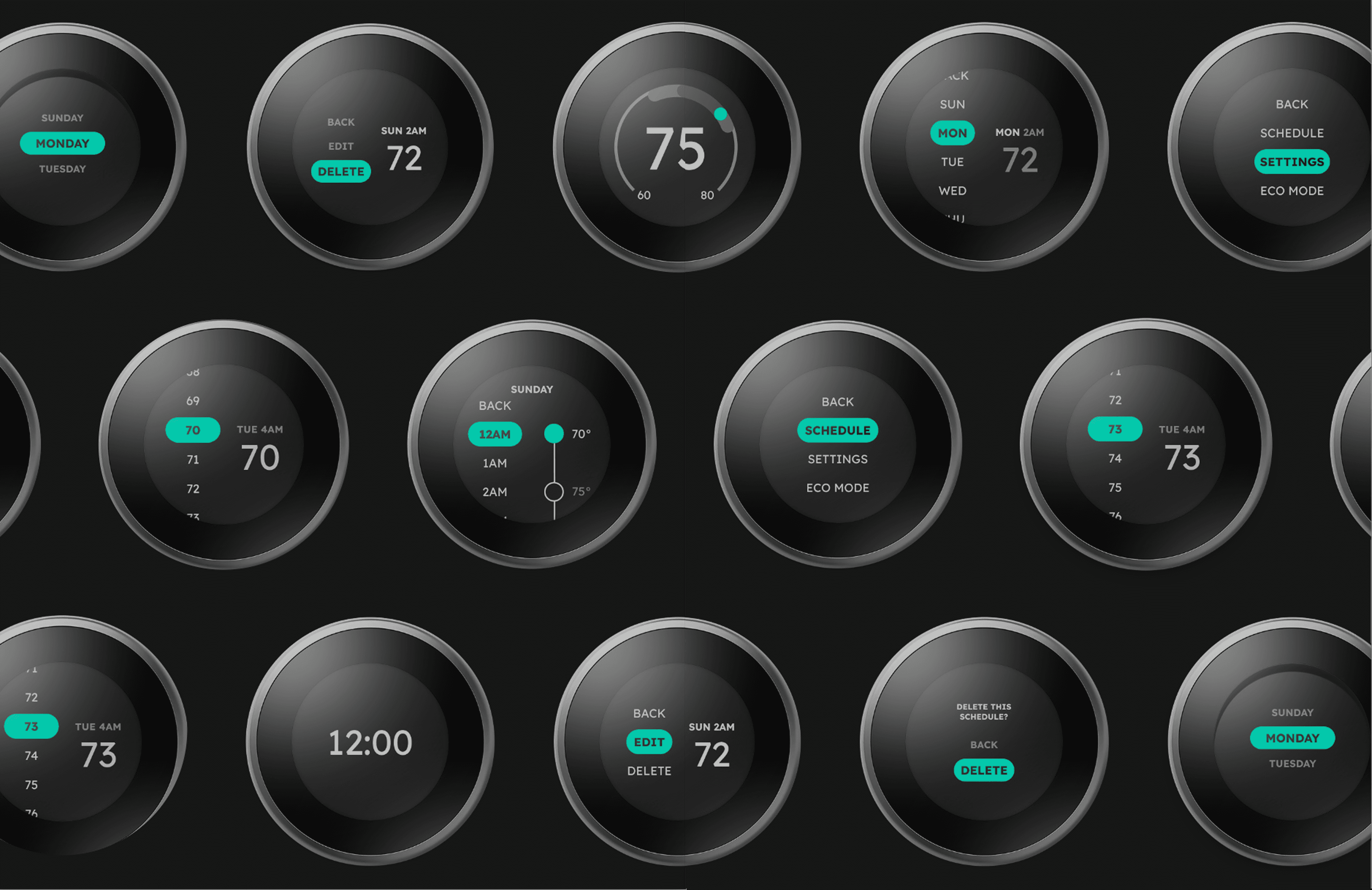
Starting all the way back, we ideated the core functions of the two devices and created Mid Fidelity screens.
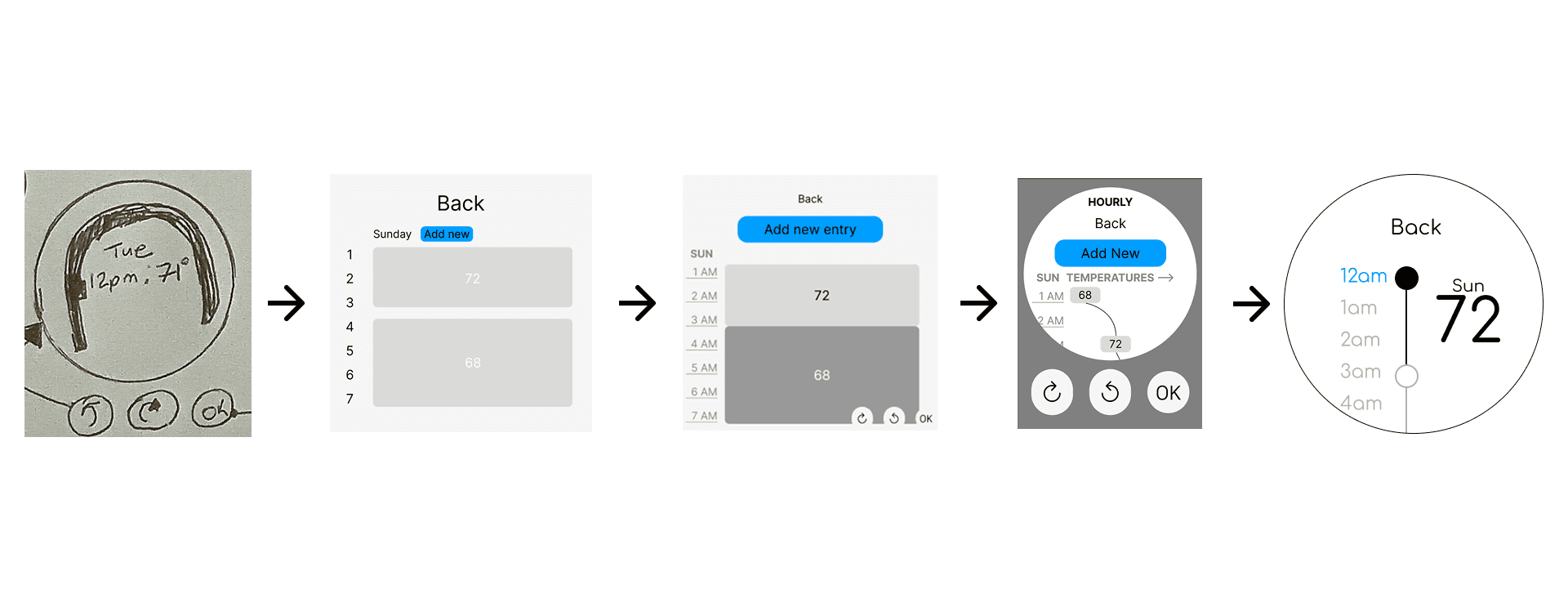
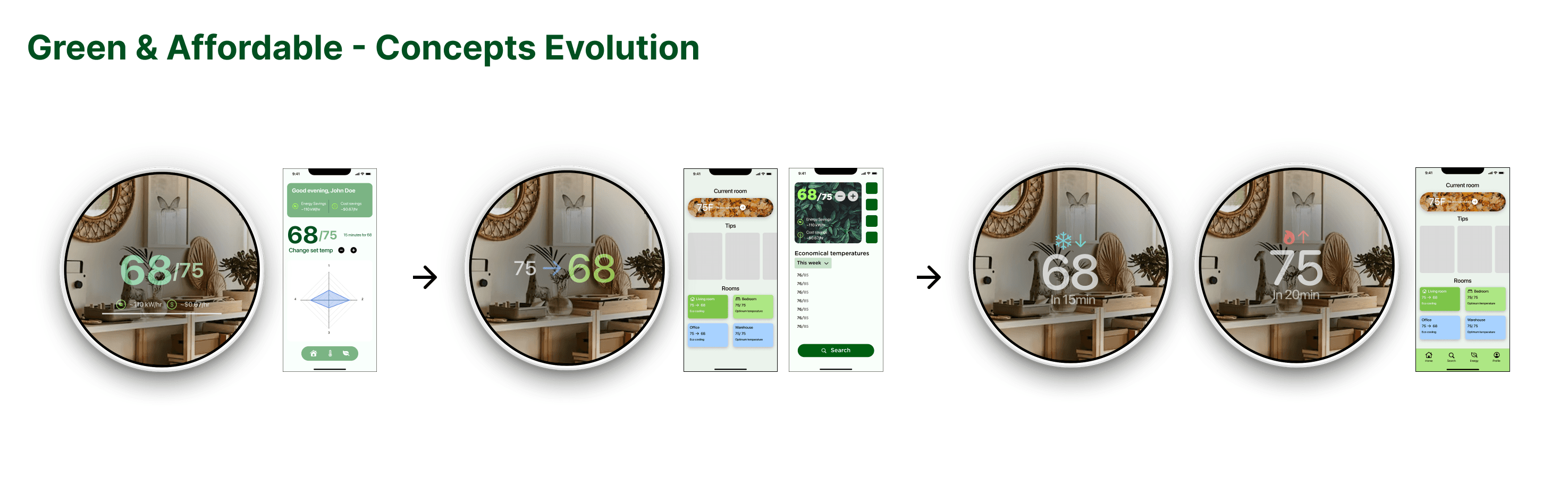
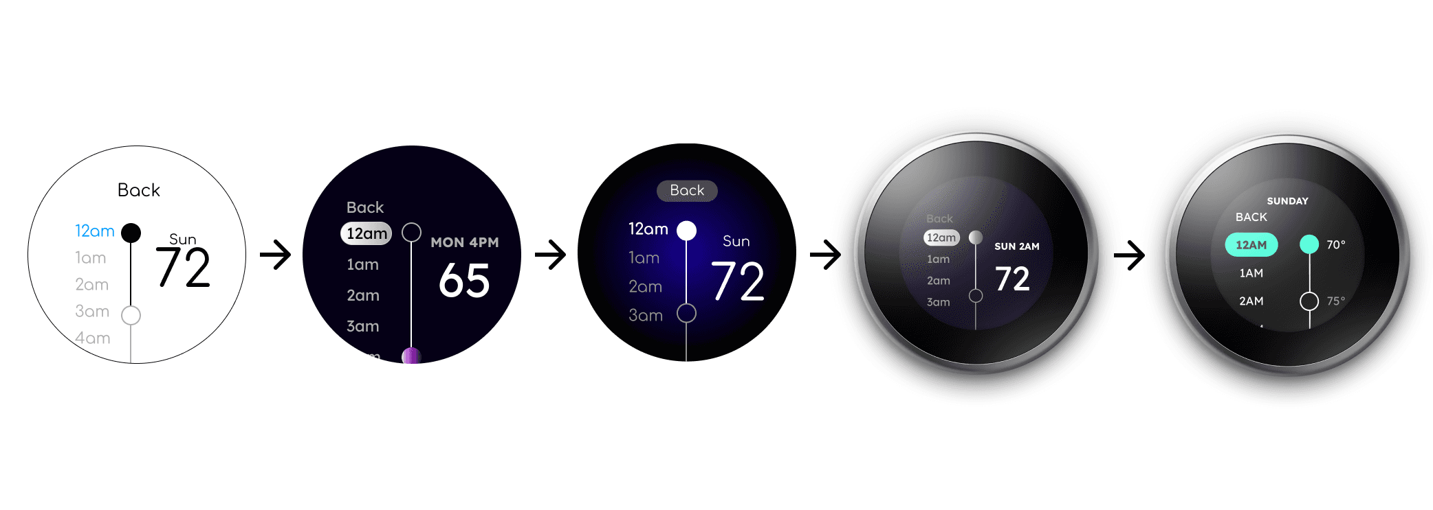
Thermostat Evolution - Schedule page
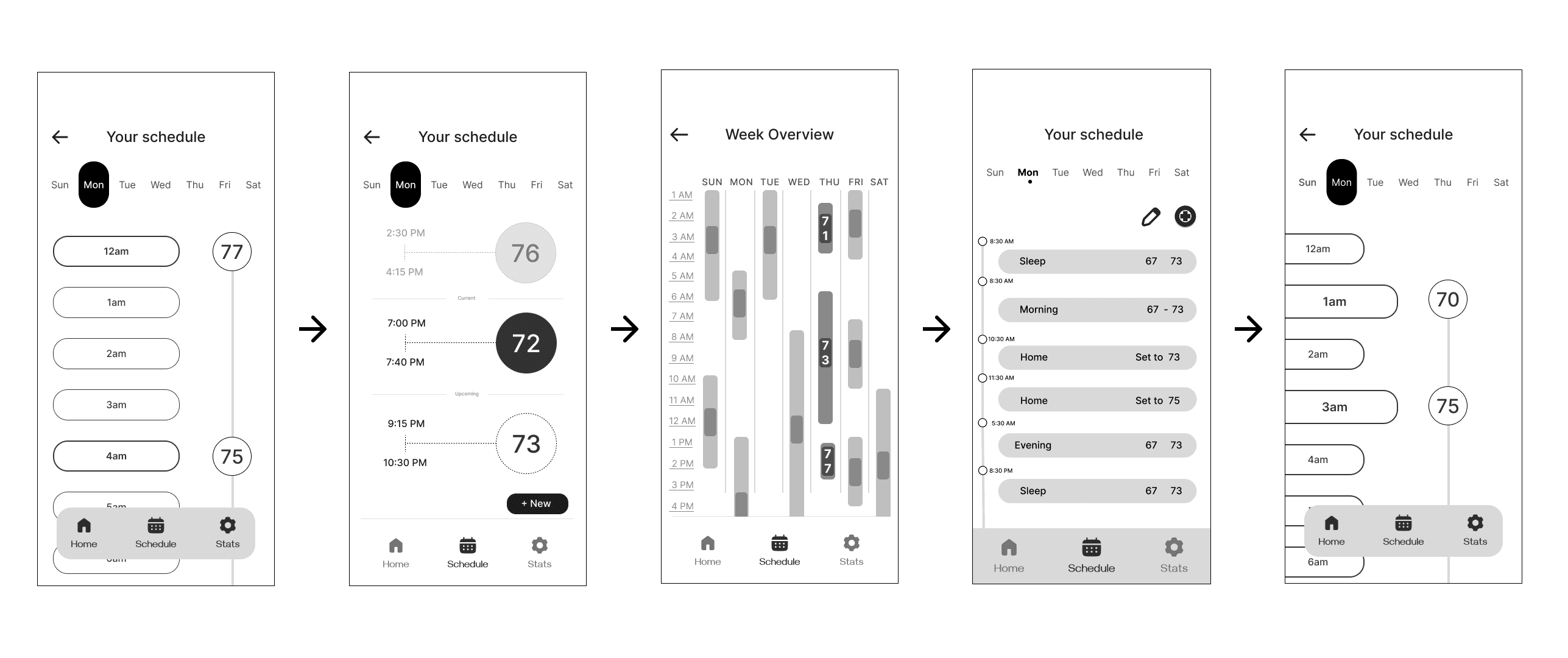
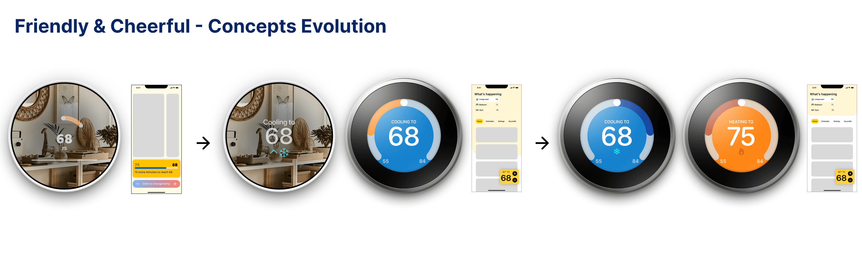
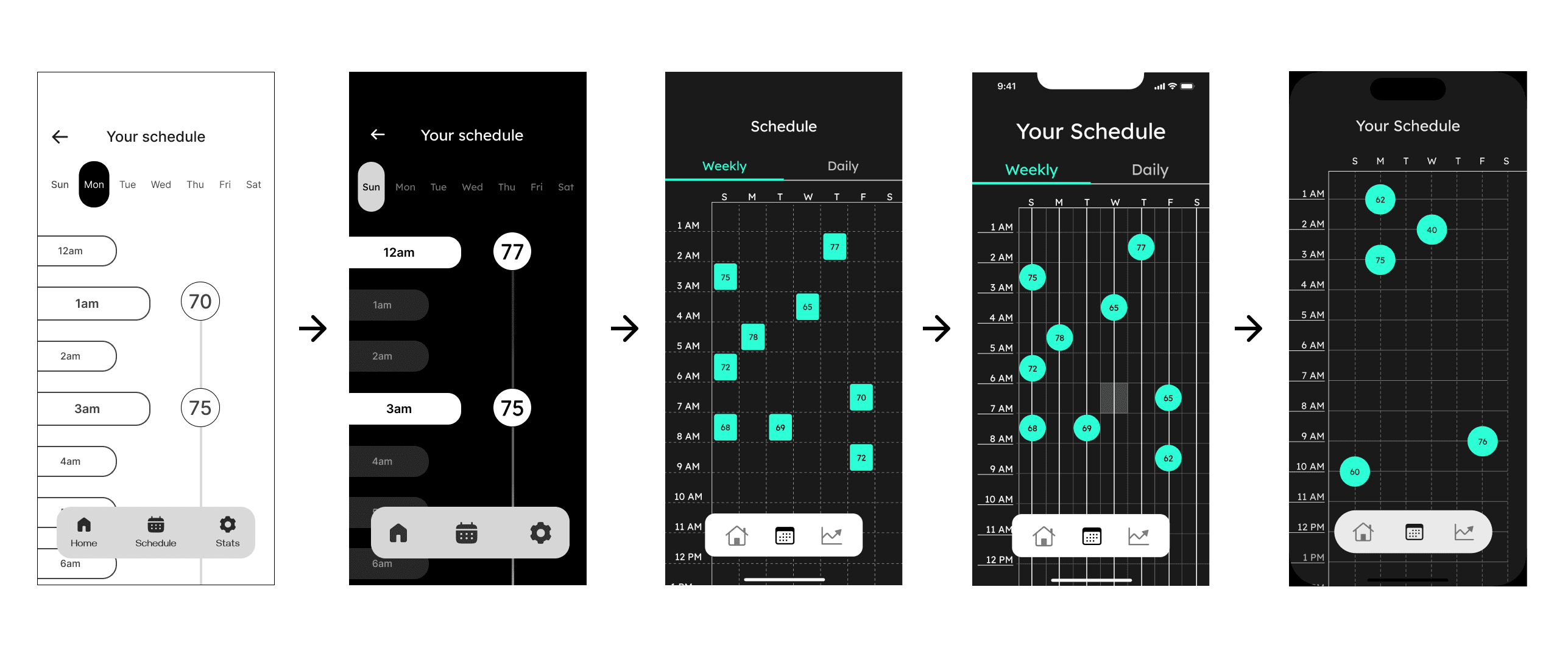
Phone Evolution - Schedule page

Initial user testing scores
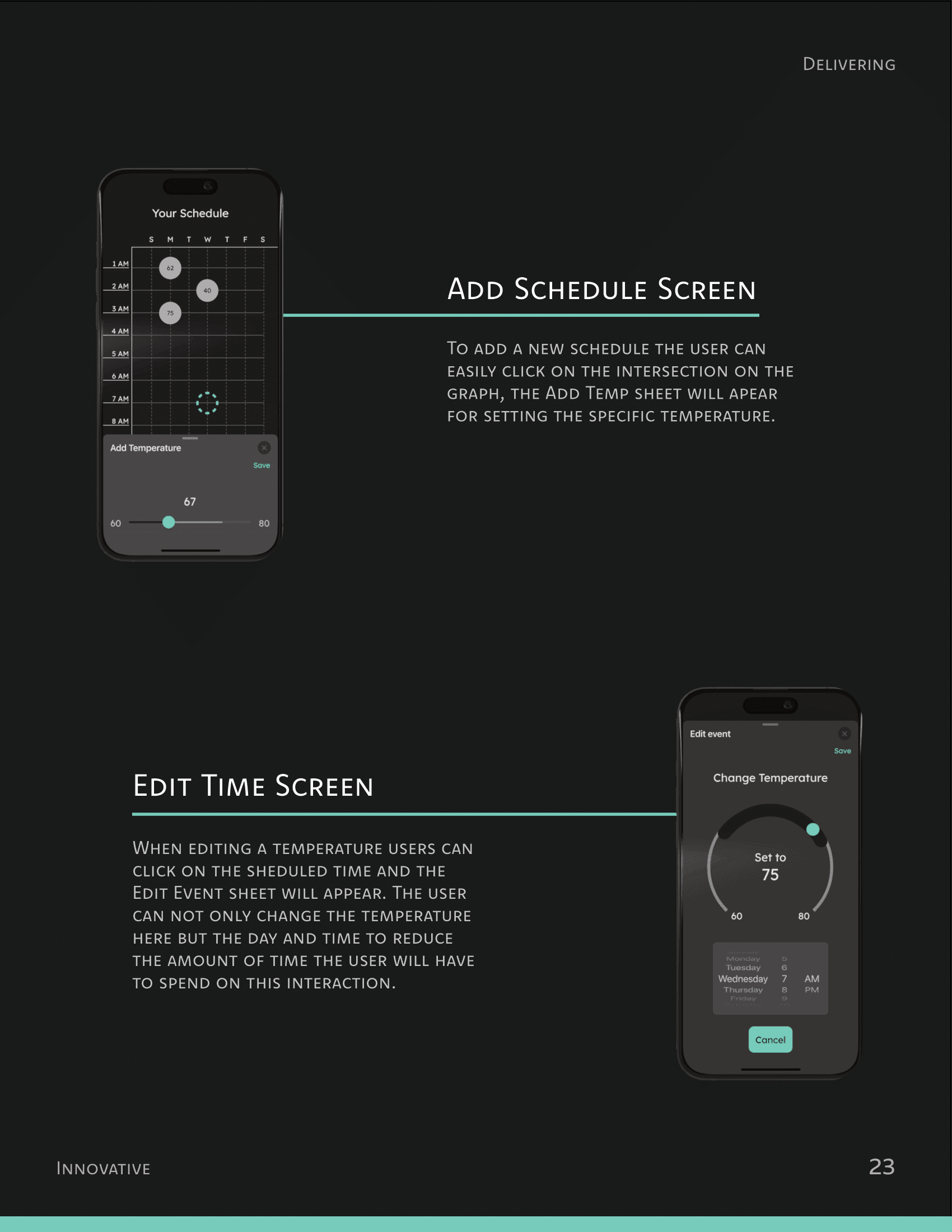
These scores were below the threshold. We decided to make key changes to screens alongside uplifting the visuals from mid to high fidelity. I led the restructuring of the information architecture for both systems:
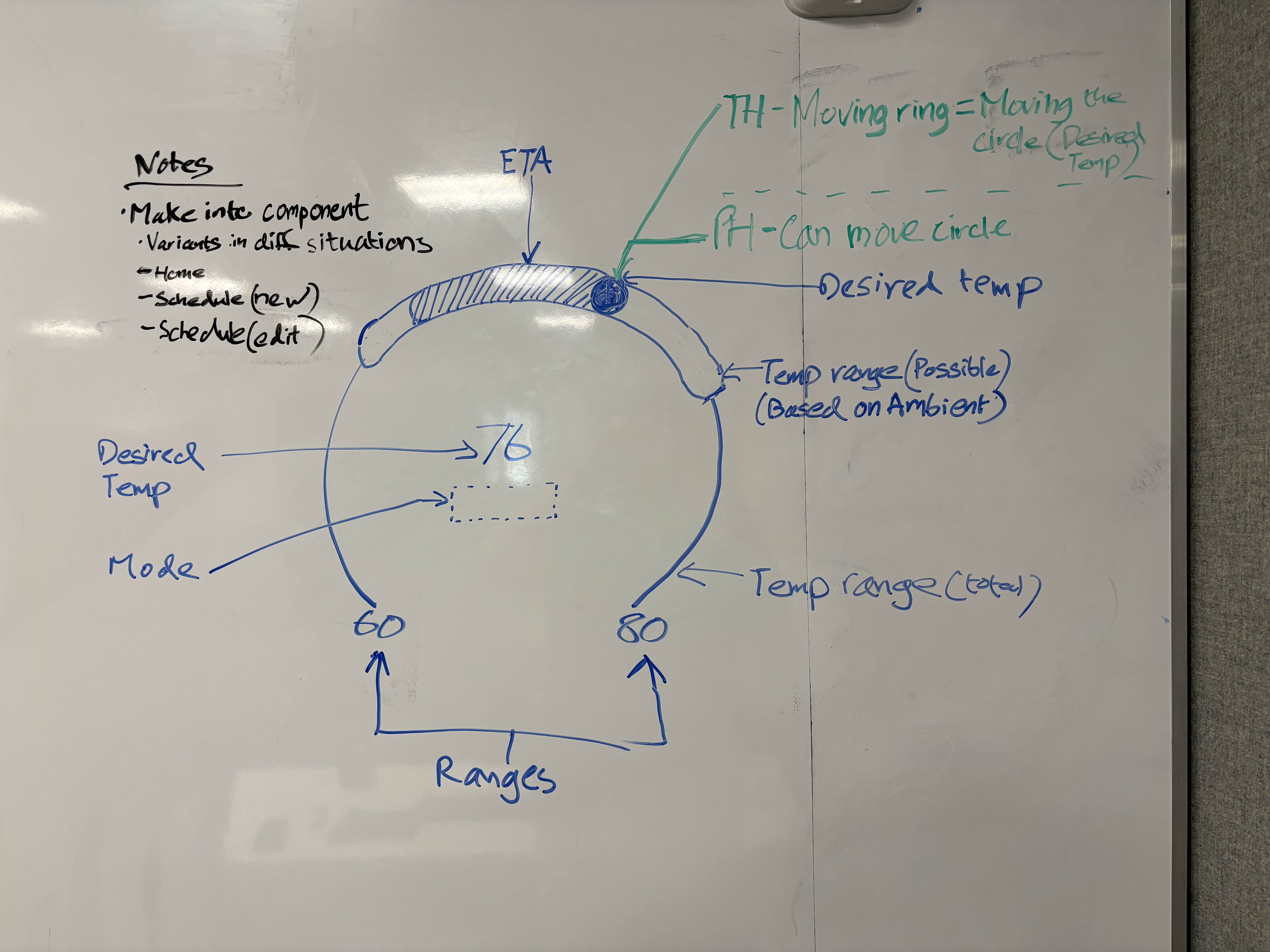
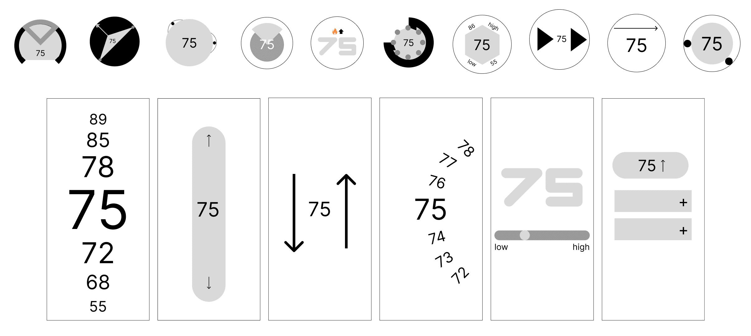
Temperature Gauge interaction ideation (Thermostat)
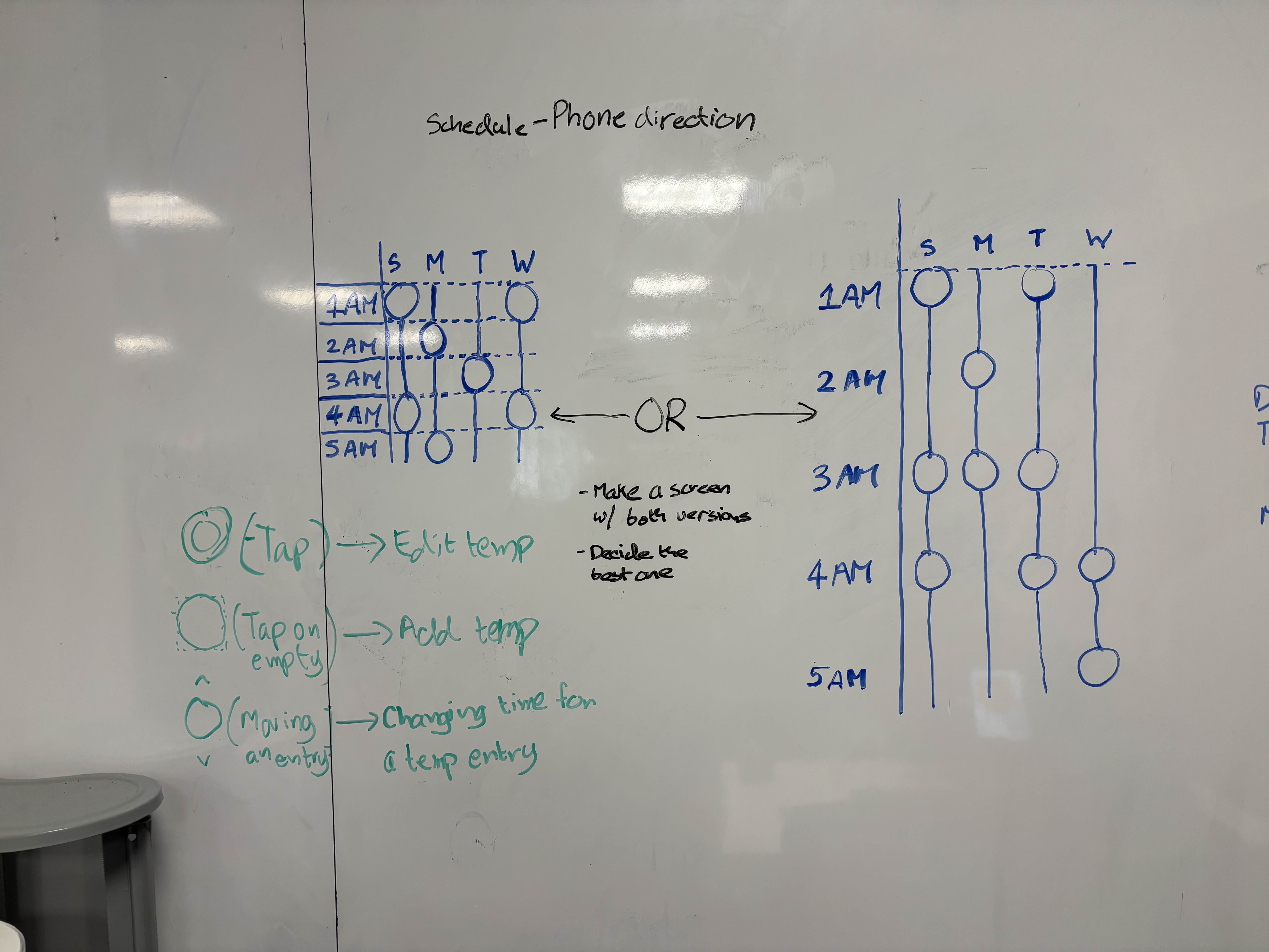
Temperature entries layout options in the schedule page (Phone)
With these changes, we started refining our designs and testing in real environment:
Thermostat Evolution - Schedule page
Phone Evolution - Schedule page

Final user testing scores
Our returning scores came out above the required threshold for the System Usability Score. We proceeded to finalize our product.
Design
डिझाईन
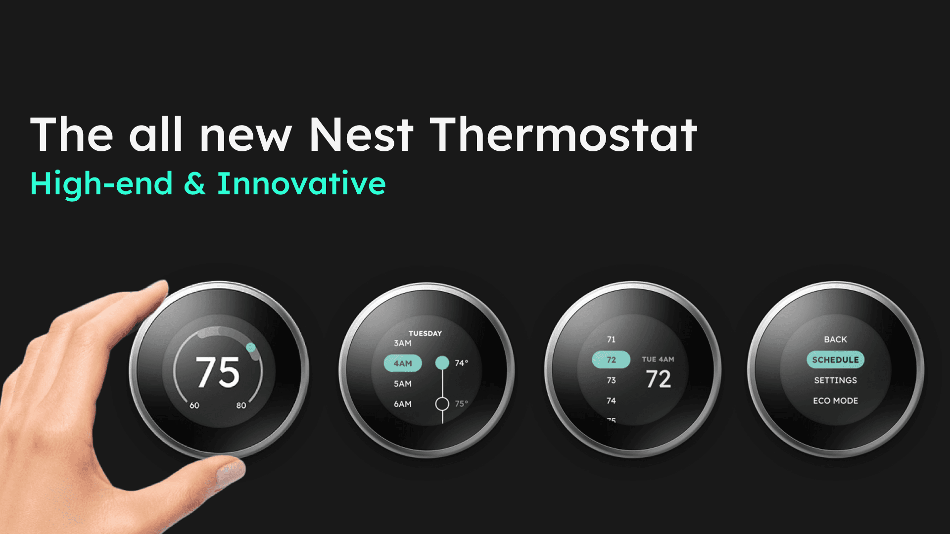
I led the final design of the UI as well as the design direction for all the deliverables.


What I learned
मी काय शिकलो
Separating the design from the designer
Earlier in the process, I used to feel attached to UI designs that were objectively worse than other versions. I felt dejected during this time, and I had to constantly remind myself to look at the process more objectively. Separating myself from the designs helped me make more rational decisions.
Failing early >> Failing later
Having remembered other design projects that had to be done in crunch, I wanted to make sure that the later half of the project went as smoothly as possible. As the Visual Design lead, I proposed to my team to constantly experiement with new layouts and designs near the start of phase 3. Doing so not only increased our speed as designers, but also gave us a chance to conduct user tests twice - something which no other team could do.